


Discover New Brand Colors
BRAND COLOR
SECONDARY COLOR
PRIMARY COLOR
ACCENT COLOR
ACCENT COLOR
TEXT COLOR
Inter Title Spacing / Font Size / Weight Weight
Playfair Title Spacing / Font Size / Weight Weight
Inter Subheading Spacing / Font Size / Weight Weight Title Spacing / Font Size / Weight Weight
Display Font: Playfair Display
The primary font is Inter, used primarily for body copy and text that needs to be easily scanned. It's the foundation font for clarity, consistency, and readability across all touchpoints.
Kennedy Blue's Voice
"KB’s voice is calm, warm, and confident. Customers are guided with clarity and reassurance, never pressure or hype. Language is polished yet approachable, always supportive, thoughtful, and intentional."
The Kennedy Blue Edit
A living reference page that shows how the Kennedy Blue brand should be presented in digital practice.
VISUALS
VOICE
COLORS
LOGOS
FONTS
VISUALS
VOICE
COLORS
LOGOS
FONTS
PRIMARY COLOR
Kennedy Blue
PRIMARY COLOR
Charcoal Grey
PRIMARY COLOR
Soft Paper
ACCENT COLOR
Soft Stone
ACCENT COLOR
Warm Sand
ACCENT COLOR
Warm Taupe
PRIMARY LOGO
Always use full wordmark when space allows.
SECONDARY LOGO
Reserved for space-constrained applications only.
PRIMARY LOGO(DARK BACKGROUNDS)
May be switched to Soft Paper on brand-color backgrounds
Kennedy Blue's Voice
"KB’s voice is calm, warm, and confident. Customers are guided with clarity and reassurance, never pressure or hype. Language is polished yet approachable, always supportive, thoughtful, and intentional."
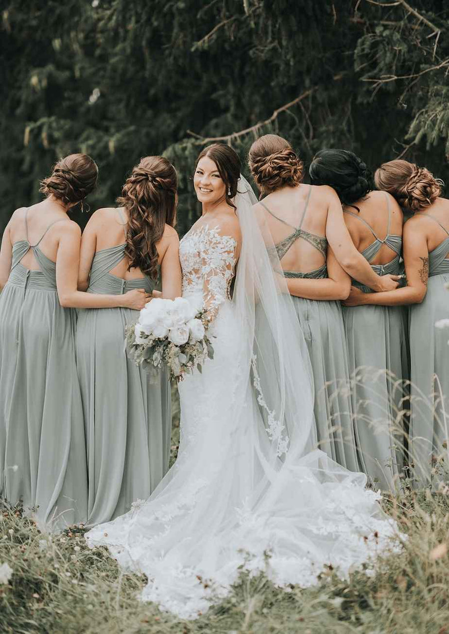
Photography Guidelines
Display Font: Playfair Display
The primary font is Inter, used primarily for body copy and text that needs to be easily scanned. It's the foundation font for clarity, consistency, and readability across all touchpoints.
The KB Edit
The Kennedy Blue Edit
A living reference page that shows how the brand feels in practice.
BRANDING
VOICE/TONE
VISUALS
COLORS
FONTS
VISUALS
VOICE/TONE
COLORS
INSPIRATION
PHOTOGRAPHY
VOICE & TONE
COLORS
INSPIRATION